
How do you update your packaging designs to appeal to new customers without displeasing your core buyers? It’s an age-old question that packaging designers struggle with.
The Butterball packaging team, along with research and design partner WovenWorks, found answers that worked for them. And, boy, did they work.
The care that went into Butterball’s 2026 packaging redesign paid off in:
The consumer research tested three significantly different designs — Love Letters, The Ribbon Evolution, and True Blue. Listen in to find out which one stood out most and became the design we see on retail shelves today.
During the process, the team uncovered four insights into the Butterball consumer, which helped inform the new packaging design:
In this video, Valerie (Val) Saint Sing, Senior Brand Manager – Seasonal at Butterball, and close partner on this project Jennifer Pleva, Associate Director of Brand Strategy, Trend & Insights, at WovenWorks, explain how they did the research, what insights they gained from it, and how those insights guided the final packaging design hierarchy for Butterball’s fresh and frozen turkeys, ground turkey, and frozen turkey burgers.
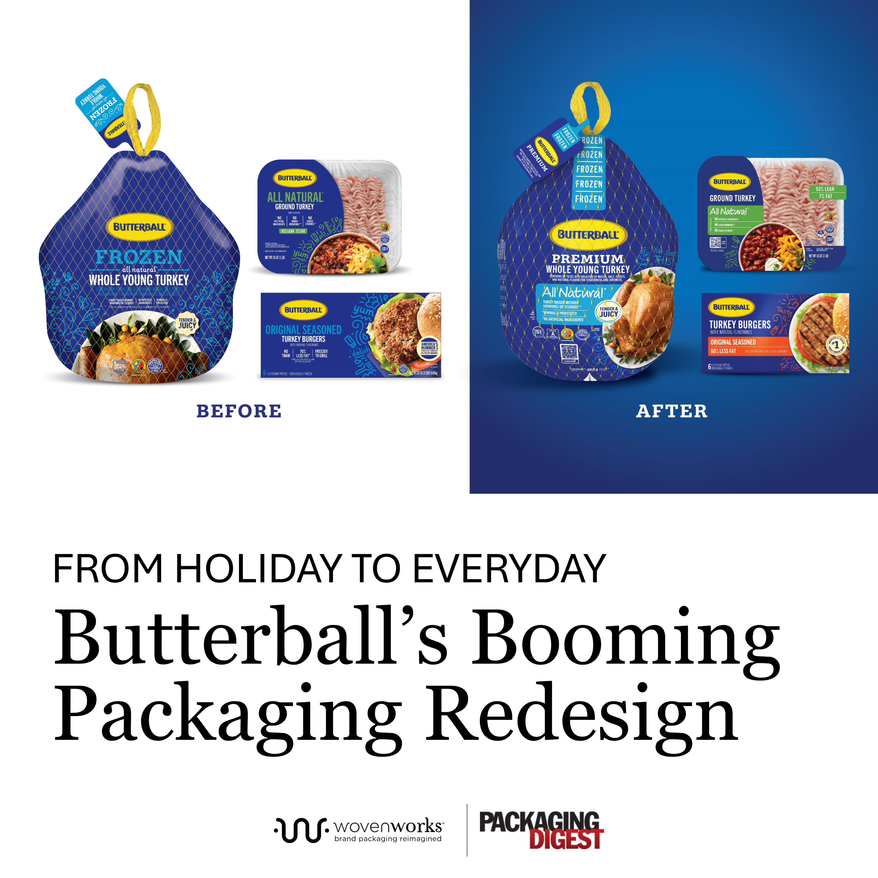
Butterball packaging before and after the redesign. The logo was flattened a bit to modernize it, the blue color is deeper and richer-looking, and the labeling is organized with color bars to indicate flavor or other callouts.
Originally published in Packaging Digest.
Lisa McTigue Pierce, Executive Editor, Packaging Digest October 27, 2026
