
Jessie Zettler, Executive Creative Director, WovenWorks
Not long ago, the beverage aisle was easy to decode. Soda was soda. Water was water. Energy drinks occupied their own high-voltage corner of the cooler, while sports drinks spoke to performance. Each category had its own predictable visual language, shopper cues, and competitive set.
That clarity is gone.
When distinction disappears, conversion does too.
Today’s beverage aisle is a chaotic collision of function, flavor, lifestyle, and identity. A single shelf might hold a prebiotic soda, an adaptogenic sparkling water, a hyper-hydration fluid, a clean-energy can, and a mood-support elixir — all fighting for the same shopper’s attention. The functional beverage boom has created enormous market opportunity, but it has also birthed a new kind of consumer paralysis.
At the same time, liquid indulgence is being reimagined. The rise of dirty soda, creamy, customized, and social media-friendly, proves consumers aren’t walking away from carbonation. They are reinventing it. They want beverages that feel expressive, playful, and deeply personal. In foodservice, that experience is built through customization, ritual, and theater.
In CPG, the package has to do that heavy lifting alone.
When every SKU promises to energize, hydrate, support gut health, or balance mood, the competitive question shifts. It’s no longer about whether a product has a benefit; it's about which brand a shopper notices, decodes, and trusts first. Packaging becomes a semiotic system: color, typography, structure, imagery, and claims all become signs that tell the shopper what kind of beverage this is, what it does, and whether it belongs in their life.
That is why packaging is the ultimate battlefield.
Functional beverages are not simply the next wave of better-for-you drinks. They are becoming the new soda wars. But unlike the classic cola battles, where mass media and iconic brand worlds drove much of the competition, today’s functional beverage brands often have to win in seconds whether in the cooler, on the shelf, in a social feed, or in a convenience store door.
Packaging is no longer just a container or a billboard. It is the fastest expression of the brand’s promise, personality, and reason to believe.
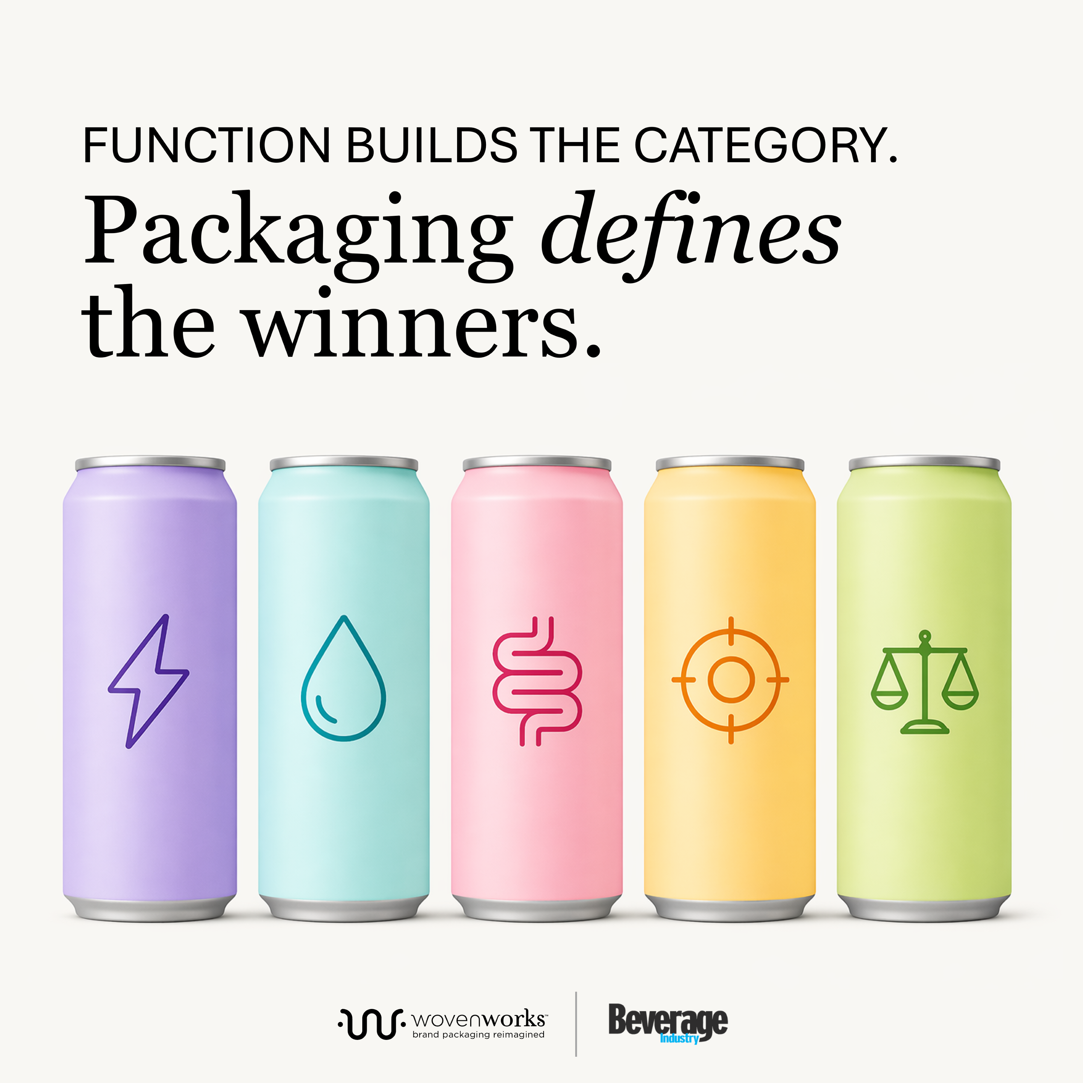
Function gets you considered. Packaging gets you chosen.
One of the biggest traps in functional beverages is building a brand solely around a claim. Energy, low sugar, hydration, gut health, and wellness support are no longer niche differentiators. In 2026, they are the cost of entry.
In a crowded category, packaging has to answer three questions instantly: What is it? What does it do? Why is it for me?
This creates a paradox: The more functional the category becomes, the harder it is for function alone to create distinction.
A shopper looking for gut health is confronted by a wall of pastel cans all promising the same microbiome miracle. In this saturated environment, packaging becomes the cognitive filter. It tells the shopper not just what the liquid does, but how the brand wants them to feel and where it fits into their identity.
These cues are not decorative; they are codes. Pastels may signal softness, approachability, or wellness. Sharp contrast may signal energy and efficacy. A tallboy can may borrow from beer culture to suggest rebellion or social confidence. A clean white base may suggest control, performance, or scientific credibility. A juicy illustration may signal pleasure before the shopper ever reads the flavor name.
In a past conversation about building a modern beverage brand, De Soi CEO Scout Brisson reflected on an early packaging design that struggled at retail:
“It was beautiful and really not designed to sit on shelf.”
That line should haunt every package designer. A package can be a minimalist masterpiece on an agency concept board, but if it fails to create instant retail recognition and accelerate the shopper’s path to purchase, it has failed its primary objective. Design must move beyond aesthetics; it has to perform.
Many brands are still over-indexing on claims, assuming more function creates more value. In reality, it often creates confusion and slows decision-making at shelf.
To survive, the most effective functional brands are moving past mere information hierarchy. They are engineering visual shortcuts.
Across the category, winning brands are deploying “high-signal” design principles to cut through the noise. In semiotic terms, they are choosing the codes they want to own and using them consistently enough that shoppers can recognize the brand before they read a word.
Color as Code: Bold, high-contrast color blocking creates peripheral visibility, but it also signals mood like energy, calm, indulgence, purity, or performance.
Typography as Personality: Oversized, expressive type can signal confidence, playfulness, rebellion, or precision before the shopper reads the actual words.
Structure as Shortcut: Can size, silhouette, material, and format can borrow meaning from adjacent categories like beer, soda, water, supplements, beauty, or wellness to quickly frame expectations.
Lifestyle as Meaning: The most compelling brands move beyond ingredient lists to signal an occasion, attitude, or identity the consumer wants to participate in.
These signals matter because the beverage shop is rarely a purely rational mission. Consumers are not just buying ingredients; they are buying a version of themselves. A morning clean-energy drink, an afternoon gut-health soda, and a non-alcoholic evening social beverage carry entirely different emotional mandates.
Packaging must make those mandates immediately visible by answering three questions in under two seconds: What is it? What does it do? Why is it for me?
Poppi is a masterclass in stripping the clinical intimidation out of wellness. It doesn’t look like a supplement; it looks like pop culture. Through vibrant color, fruit-forward illustration cues, and accessible soda typography, the brand reframes gut health from a medical chore into an everyday indulgence.
Semiotic cues that could have pointed toward supplements, digestion, or clinical wellness are replaced with codes of flavor, fun, and mainstream soda culture. The result is a brand that makes prebiotics feel less like a functional obligation and more like a small, colorful reward.
The Lesson: Function may be the reason to believe, but Poppi uses sensory cues to remove friction to trial and make gut health feel easy and enjoyable.
Water is the ultimate commodity, yet Liquid Death broke the category by rejecting the historical visual language of purity, clouds, and springs. By packaging water in tallboy beer cans wrapped in heavy-metal iconography, the brand borrows semiotic codes from beer, music, and counterculture, then applies them to one of the most basic products in beverage.
The result is not just differentiation; it is reclassification. Water becomes a badge of subversive cool.
That is a critical shift in modern beverage design. The can is no longer just a container; it is a social object. It is a prop for TikToks, gym bags, concert venues, office desks, and parties. Packaging must carry identity long after it leaves the cash register.
The Lesson: The most disruptive brands do not simply look different. They unlock new consumption occasions by changing what the category can mean.
Where legacy energy drinks leaned into chaotic, aggressive counterculture aesthetics, Celsius introduced a clean, white-base design language that feels active, premium, and accessible. Flavor gradients add appetite appeal, while white space and prominent functional callouts signal control, efficacy, and clean fuel — not a chemical experiment.
Celsius proves that restraint can be just as powerful as maximalism when the codes are clear. The brand does not need to scream to communicate energy. It uses visual discipline to make performance feel modern, credible, and everyday.
The Lesson: Benefit-forward packaging can still feel lifestyle-driven when the visual system signals an everyday routine, not an extreme use case.
For brands looking to survive the next iteration of the beverage wars, the playbook has changed.
The dirty soda phenomenon shows that modern beverage consumption is rooted in self-expression and ritual. But packaged functional drinks do not have the luxury of tableside theater, barista interaction, or a custom fountain experience. The visual system has to compress that entire story onto a 12- or 16-ounce canvas.
A prebiotic soda is not just about gut health, and an energy drink is not just about caffeine. Each one is trying to own a specific moment in the consumer’s day. That means packaging must make the benefit feel enjoyable, ownable, and emotionally relevant, almost instantly.
As the market matures, functional claims will become easier for competitors to copy. The shelf will only get more crowded. When formulations and nutritional profiles reach parity, design becomes the true differentiator.
The winners of the new soda wars won’t just be the brands that formulate the best liquid. They will be the brands that translate function into feeling. When every drink promises a benefit, the package has to do more than hold the product. It has to turn function into feeling and feeling into purchase.
The next wave of beverage winners won’t just have better formulas. They’ll have clearer signals.
When every drink offers a benefit, the brands that win are the ones shoppers can understand and trust in seconds.
Because at shelf, feeling isn’t a bonus. It’s the decision.
If a shopper can’t instantly understand what your product is, what it does, and why it’s for them, you’re leaving growth on the shelf.
About WovenWorks
WovenWorks is a packaging and brand strategy firm that helps brands turn packaging into a driver of growth. By combining consumer insight, creative strategy, and production expertise, WovenWorks creates packaging that cuts through complexity, drives faster decisions at shelf, and delivers measurable business impact.
Read the full original article at Beverage Industry
